City of Lewisville Fire Department
A Responsive Government Website Design
History
The City of Lewisville became incorporated in 1925, and there was no formal staffing for the fire department at that time. Over the years, Lewisville has blossomed and grown from a small town to a bustling city, with a population of nearly 100,000 citizens. To accommodate the growing number of citizens, the Lewisville Fire Department has also grown to 8 stations which houses six fire engines, two aerial ladder trucks, five MICU ambulances and two Dive Rescue boats.
My role: UX Design | UI Design
Overview:
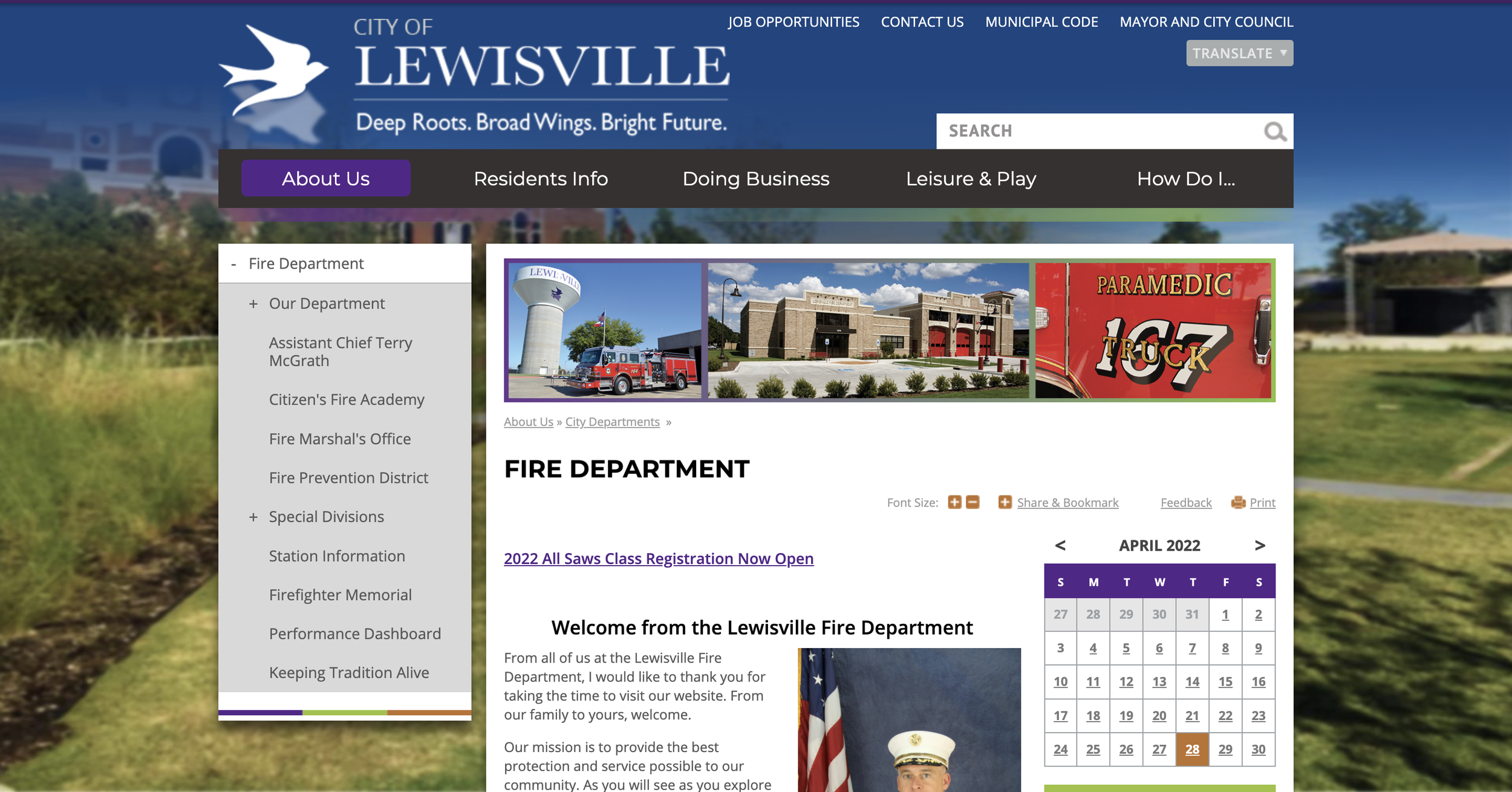
The current Lewisville Fire Department website.
Problem
The current website has outdated information that needs to be changed out. Also, the current navigation system is confusing, even for seasoned employees of the department. This means that Lewisville citizens will have an even more difficult time navigating to parts that they’re looking for. The website is not a responsive one - meaning that it’s not user friendly on the tablet or mobile phone.
In the future, there might be an opportunity for the website to change platforms which will provide an opportunity to make it more responsive. The current website also looks a bit outdated - we can elevate it to a more modern look that’s minimalistic.
Goals:
Creating a responsive website that’s easy to use and navigate, as well as being inclusive as possible for everyone.
Understand the navigation flow difficulties within the current website.
Determine what other cities’ fire departments are doing successfully with their websites.
We want to understand the characteristics and needs of website visitors so that we are able to build a successful online platform that caters to nearly everyone.
Process Overview:
-
Identify the research goal, objectives, and questions.
-
Determine the best way of determining information architecture by feature roadmap, creating a site map, and creating page sketches.
-
Creating a task flow/user flow, responsive wireframes and wireframes in order to visualize the flow of the site.
-
Developing a style tile to create a cohesive and modern look
-
Creation of a high fidelity prototype, conduct usability testing to ensure user flow, creating a flow map and affinity map.
Research
Interviews, Competitive Analysis, and Persona
Interviews:
Goals: Participants were driven to complete tasks that a site visitor may try to complete on the website, such as finding public information, or trying to apply to become a firefighter/find information on what’s required to become a firefighter.
I interviewed 5 people between the ages of 27 to 33. To summarize, it was extremely difficult for participants to navigate the website.
Expectations: Varied but some overlapped.
Participants expected basic contact information, hierarchy of officials/top officials, a career page/HR, and news update or a space for comments/news.
Other expectations are: answers to frequently asked questions/resources, locations, general description of the company, history, and educational resources.
Frustrations: Participants were asked to complete some tasks, and only two participants out of five were able to successfully complete all of the tasks. Two participants did not realize that more options were available to view through if they had clicked the + sign on the left menu items, meaning that the + sign is not instinctual.
Public education material task: 4 out of 5 participants were able to complete this task.
Application to become a firefighter task: All participants were able to complete the task.
Page to find requirements to become a firefighter task: 2 out of 5 participants were able to complete this task.
Impressions: Participants were asked what their first impression of the homepage were, and how they felt while going through the website.
1 participant wished there was more color on the page - another participant said the color purple stood out to him
Participants stated it felt like a typical city website, and that there were a lot of information to go through.
1 participant stated that the site felt dated.
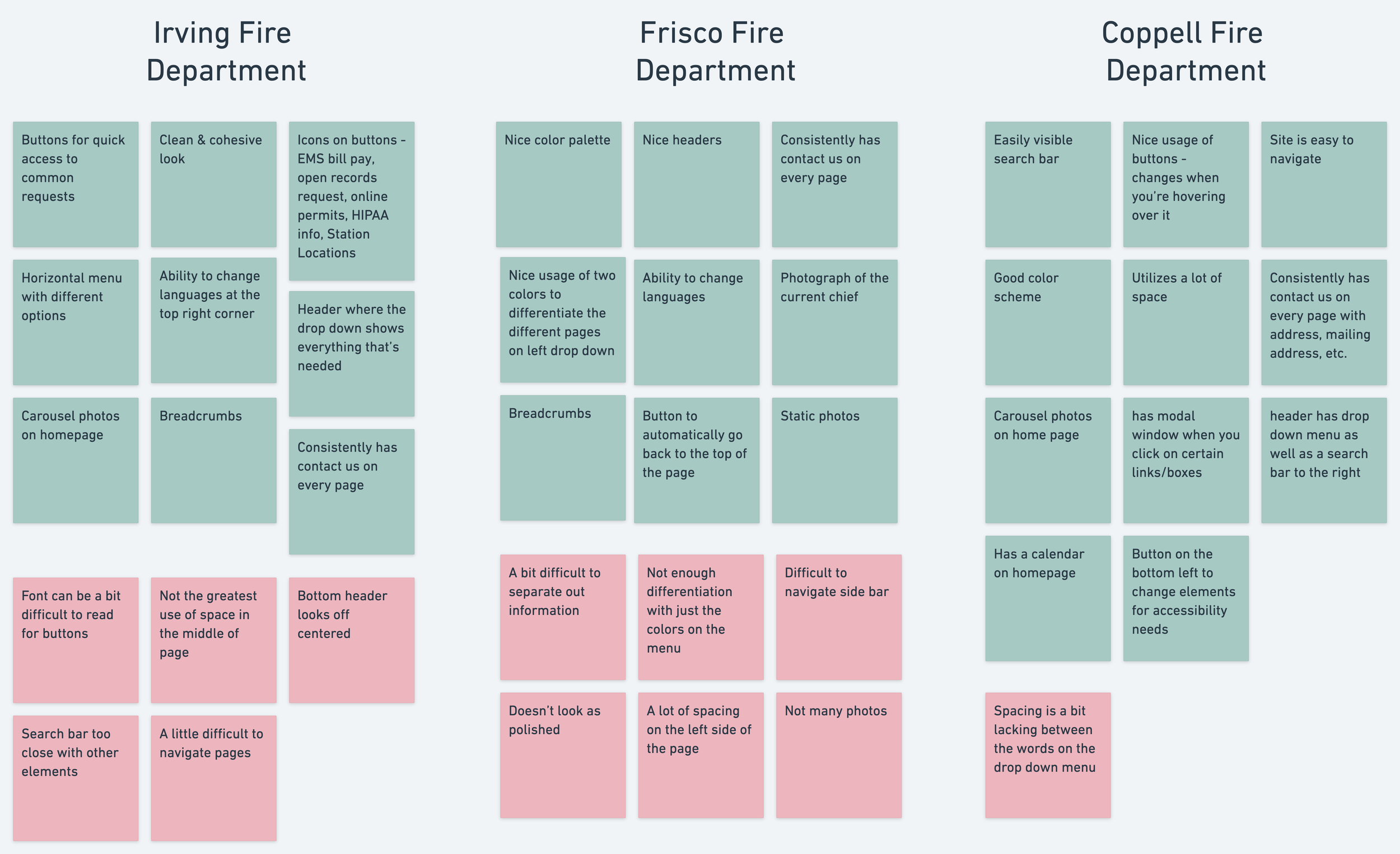
Competitive Analysis:
I researched three different cities’ fire departments to conduct a competitive analysis. The Lewisville Fire Department’s site isn’t doing too poorly when compared with other cities’ fire department pages. But, there definitely is a need for some improvements made. Fire departments have a lot of information that they need to convey to visitors without overwhelming them, and trying to display those information may make pages difficult to navigate since they don’t want to leave anything out. Websites are also a way for the department to connect with people, as well as to increase “brand awareness” within the community.
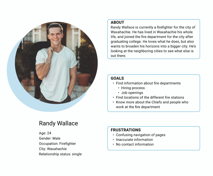
Persona:
My research confirmed my suspicions, which is that local government websites have a perceived conception of it being confusing. And, when conducing my interview, the current website is confusing. I synthesized my competitive analysis (the five other surrounding local government) and interview results to come up with a persona - Randy Wallace.
2. Information Architecture
Feature Roadmap and Sitemap
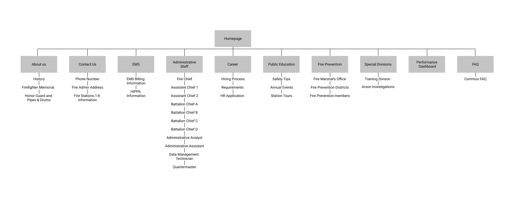
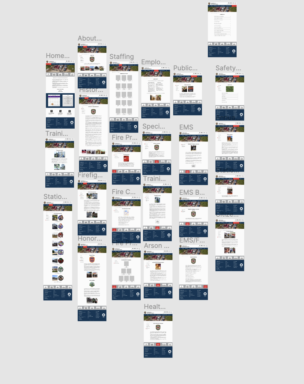
Sitemap
I created a feature roadmap based on my user research conclusions, the city’s needs, my persona, and my competitive analysis. The priority of this list is based off of the importance to the business and users, and it helped remind me of what the key elements to this website are.
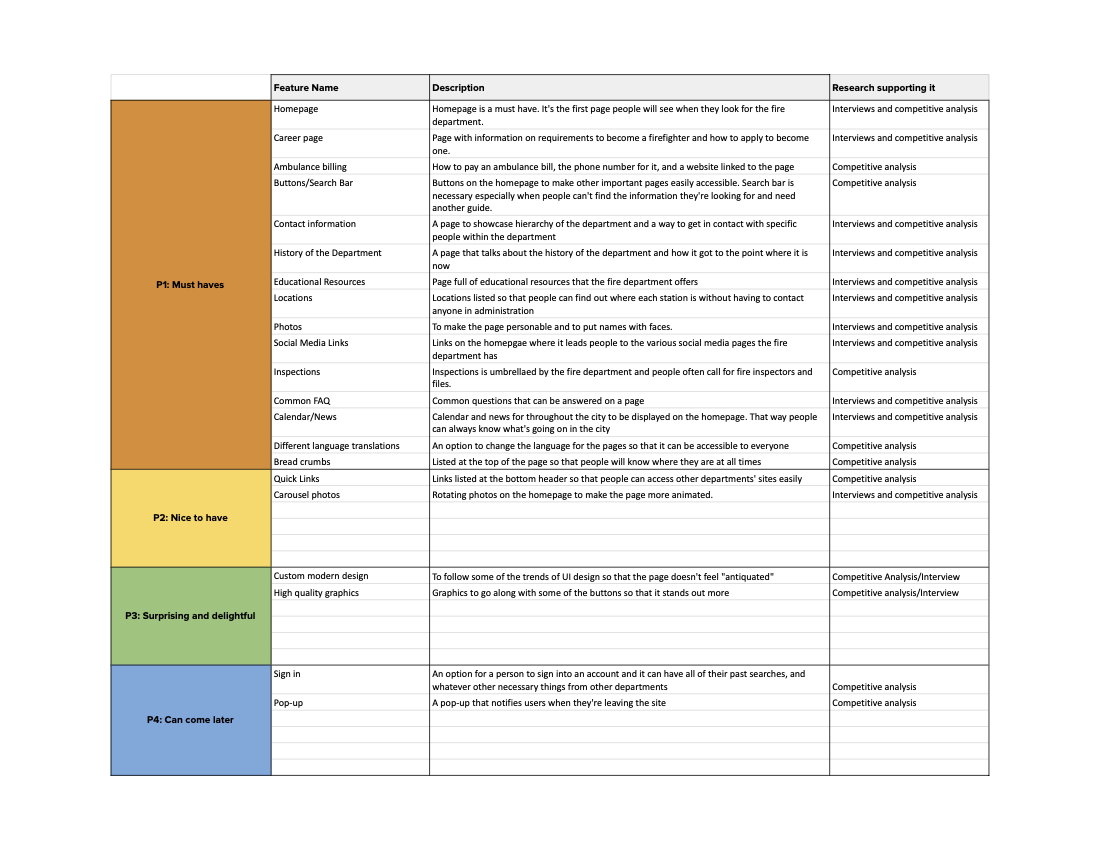
Feature Roadmap
I created a sitemap was created to build out the layout of the wireframes for the Fire Department’s website. Since there’s a plethora of information, there’s also a lot of different pages. A lot of the information on this page is already on the current website, but has a confusing pathway.
3. Interaction Design
Task Flow, User Flow, Product requirements, Page Sketches, and Wireframes
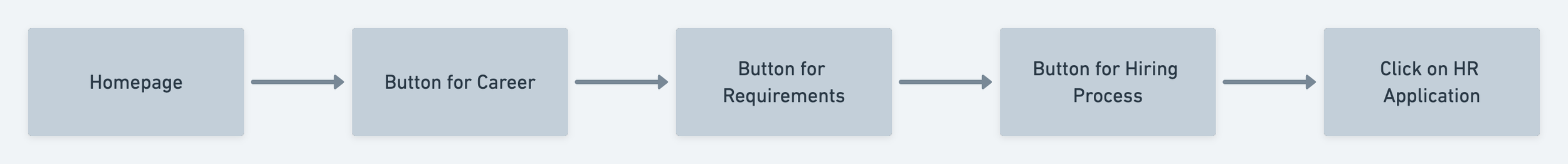
I created a task flow that my persona would take on this site. In his case, he is trying to apply for an open firefighter position.
Task Flow
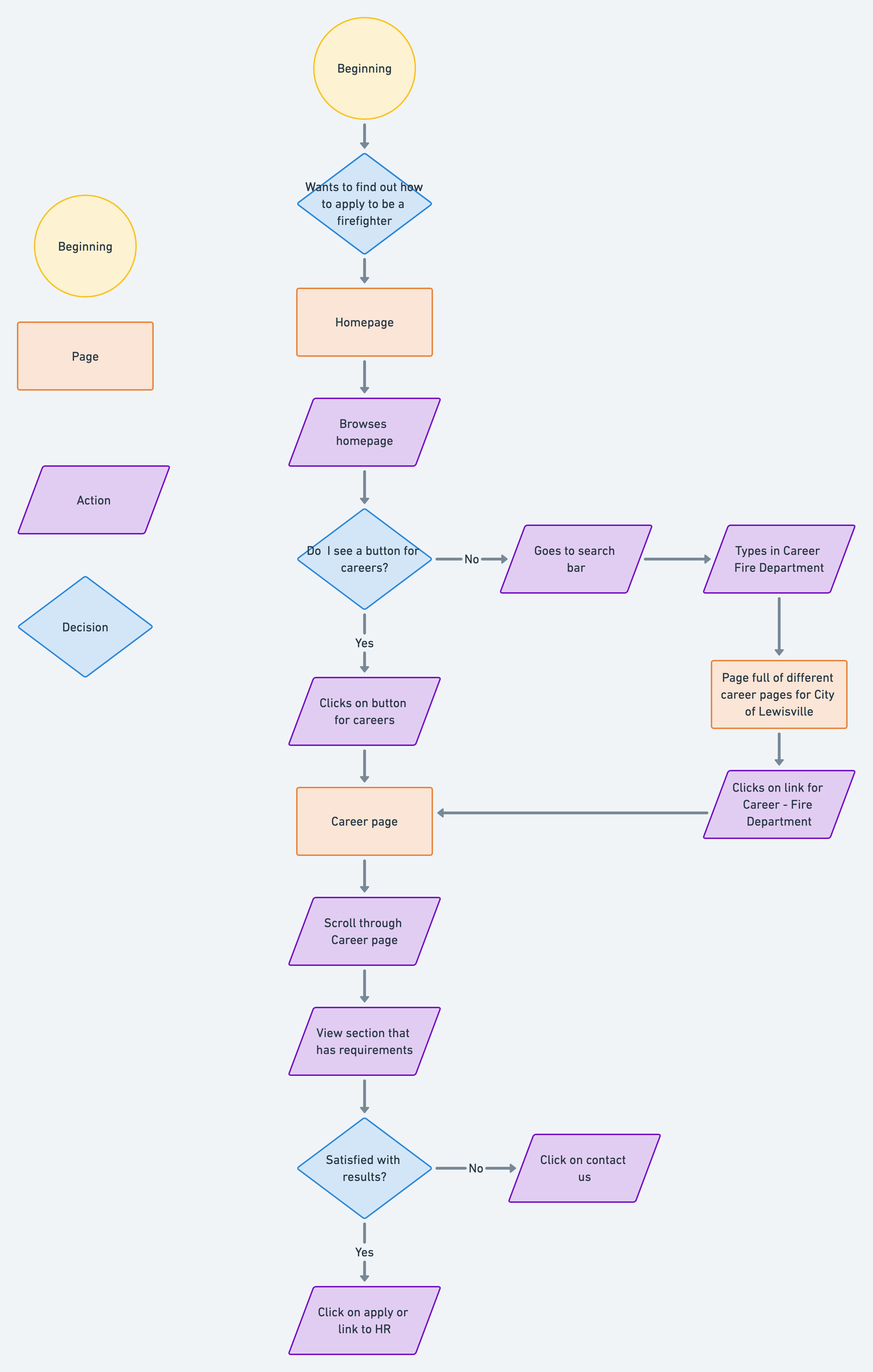
User Flow
I then created a user flow to map out the possible pathways that the persona could take when navigating from the homepage to applying for the position. Also, I didn’t directly include this on the map, but oftentimes before someone applies for any position, they do some research about the company. So not only are the pages for this path important, but also other information about the organization is important as well.
Product Requirements:
Product requirements was created based off of user flow, site map, and feature roadmap. I created a list of pages to design:
Homepage
About Us page
Contact Us page
Career page
Public Education page
Fire Prevention page
Special Divisions page
Performance Dashboard page
FAQ page
EMS page
Administrative Staff page
I also listed out detailed requirements for each of the pages listed above, and this became the page I based my wireframe on. I wanted to make everything as detailed as possible since this was my place of employment.
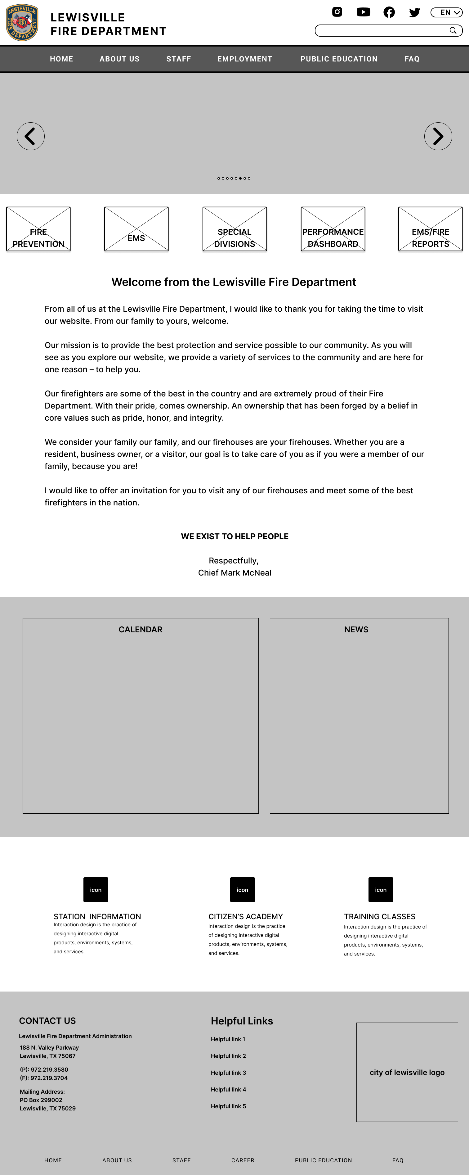
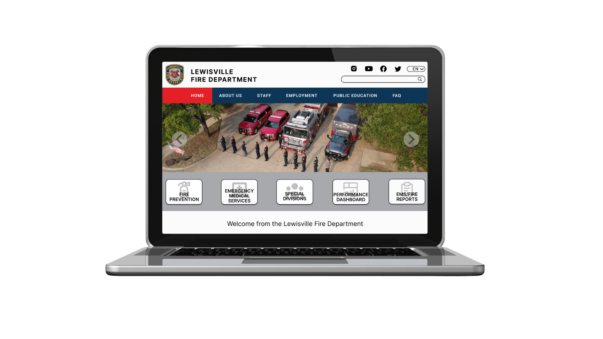
Wireframes
After completing detailed requirements for each of the pages, I then created digital wireframes that I later used to create a prototype. I wanted clear buttons so that users won’t be confused about navigation.
4. User Interface
Brand Style Tile
I created a brand style tile with the colors of the badge. I wanted the page to feel cohesive with the department badge, since that is something that the department is proud of. It’s also a logo for citizens to recognize.
I also included some pictures of inspirations of other departments’ websites (not local areas) to show how modern their sites are.
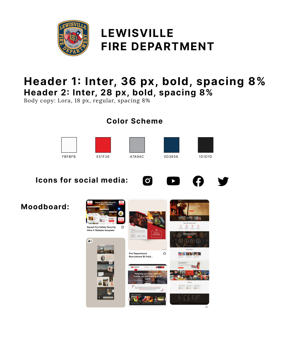
Brand Style Tile
5. Iteration and Implementation
Prototype, Usability Testing, Affinity Map, and Priority Revisions
After inputting colors and photos into the wireframes, I then created flows based off of the pages and user flow chart I created earlier. The paths should lead users to the end goal - which is to apply to become a firefighter. I also wanted to add in more flows than what was probably necessary in order to allow users to see the flows of information.
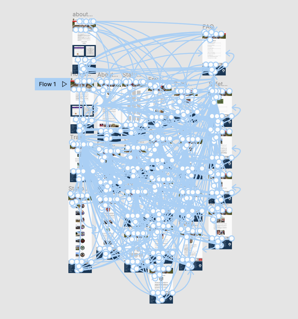
Prototype
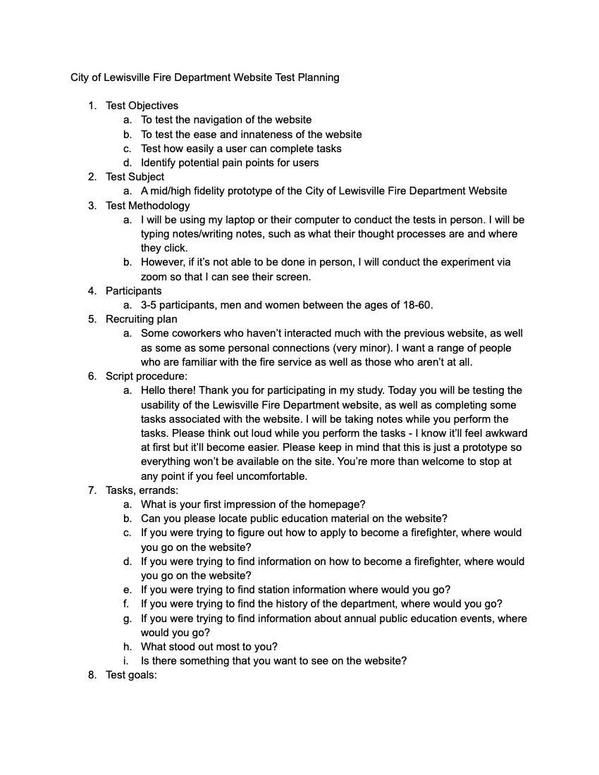
Usability testing was done in person. I asked four participants a series of questions and tasks to get data for an affinity map.
Test objectives:
Test the flow of the website
Test the ease of navigation through the pages when browsing for products
Test how easily a user can complete tasks
Identify pain points
Test goals:
To identify what works well on the Fire Department website
To see how easily users can complete tasks
To identify pain points that needs improvement
Usability Testing
Affinity Map
I created an affinity map from the responses I had gotten to my questions when conducting a usability test. This allowed me to get some insight on the changes that needed to be made on my prototype.
The link to view the Figma file can be found at the top of the page. I made changes based off of the affinity map. Here are the following changes I made:
I added phone numbers underneath peoples’ pictures in staffing and fire prevention staffing.
I added a few things to make navigation easier.
Training class button on training division page
About us page separate from the History